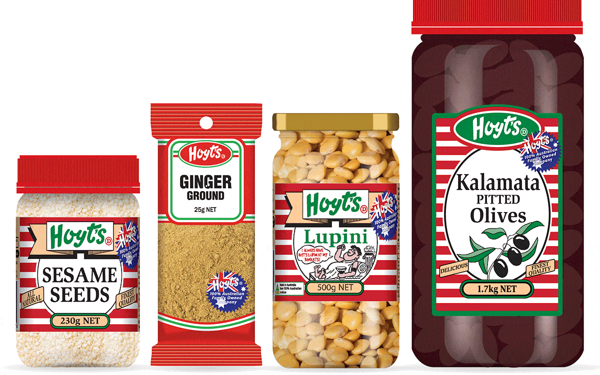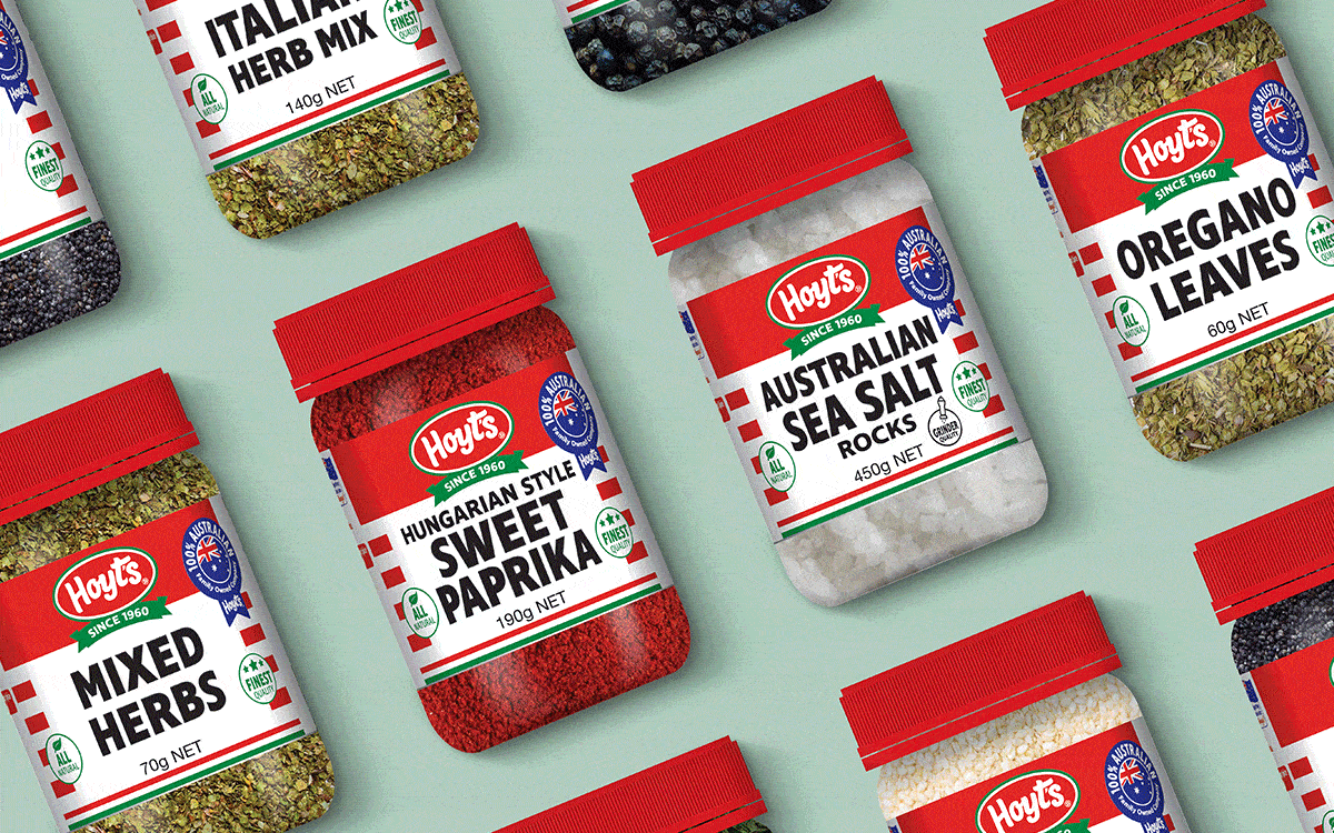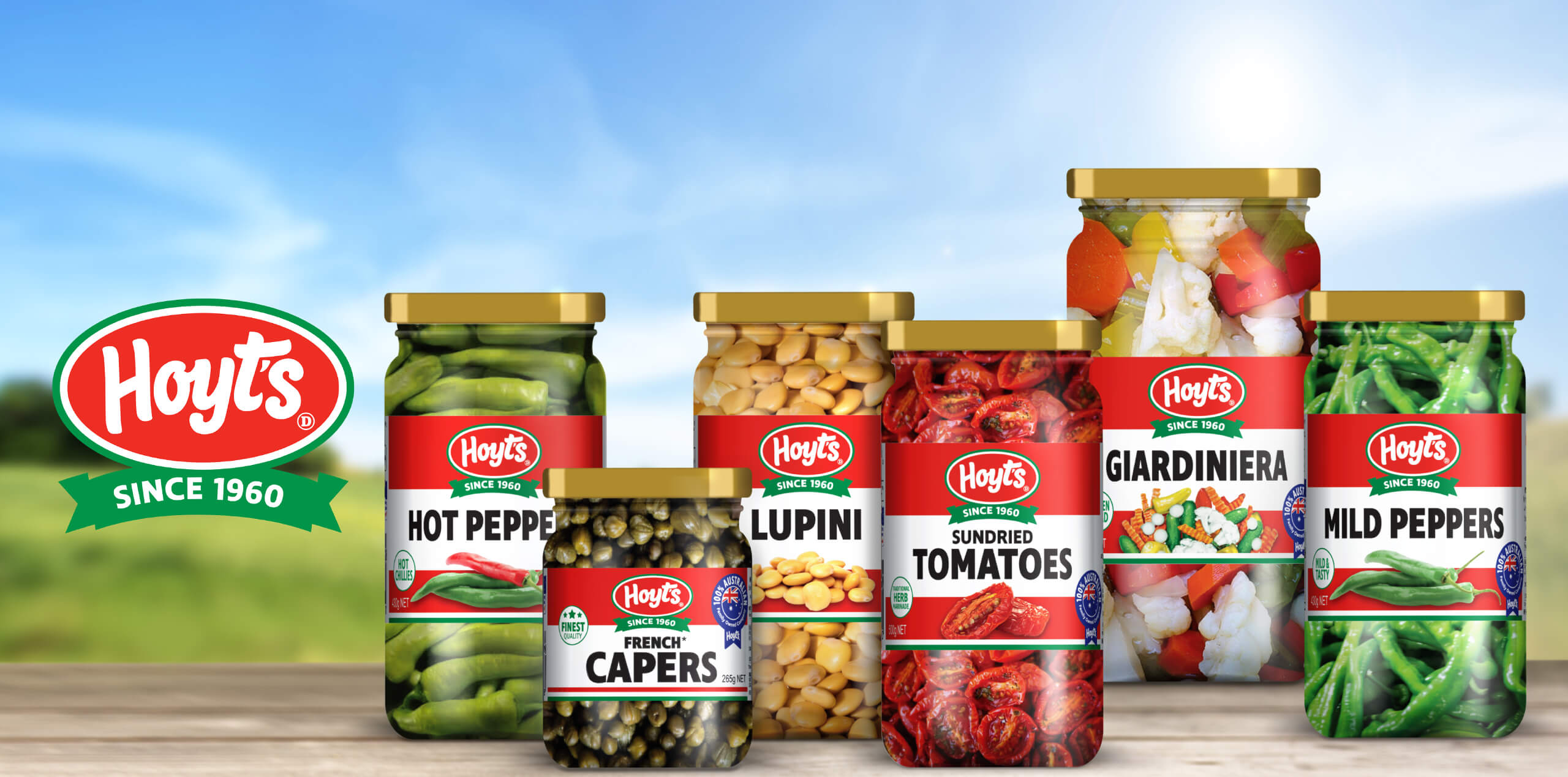
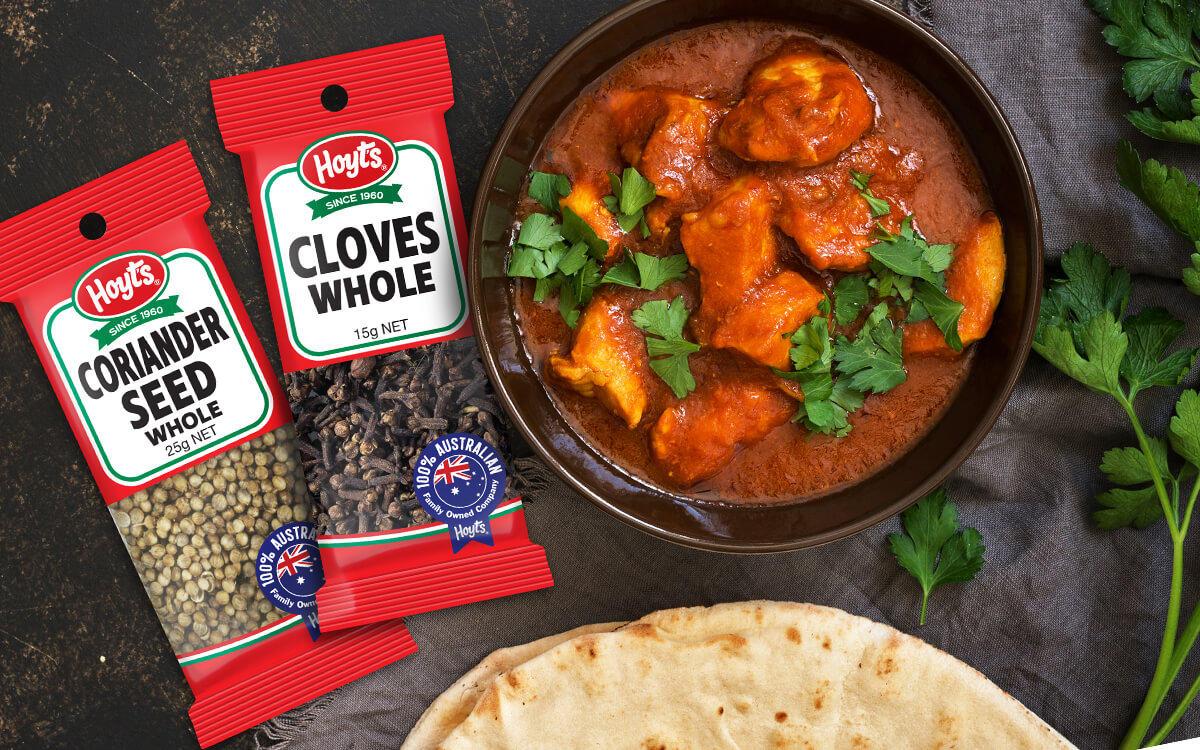
The Hoyts brand has been a staple of Australian pantries since 1960 providing families with the flavours to create delicious and authentic food. As the opportunity for new lines emerged the Hoyts brand was continually adapted and changed which created disjointed brand recognition on shelf. There was no synergy of the Hoyts brand between products nor was there a consistent approach to how typography, colours, imagery and brand attributes were presented to the consumer.
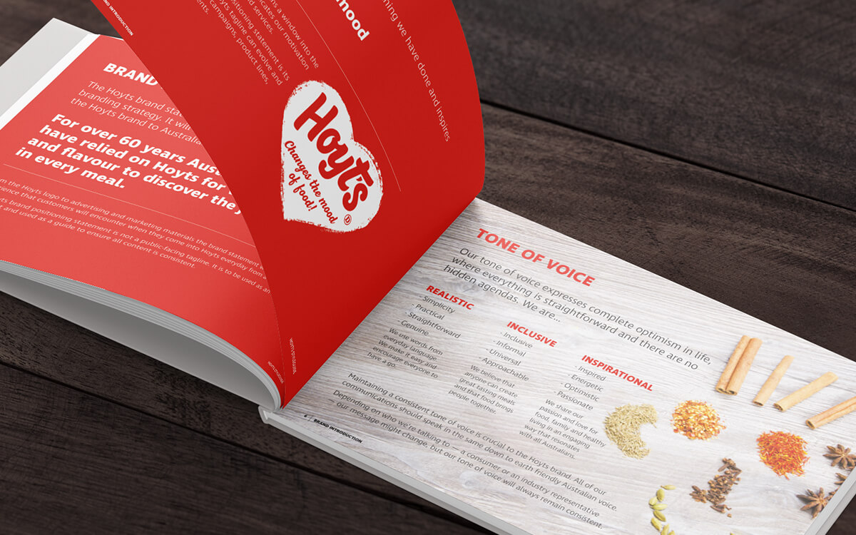
Night & Day undertook a brand review which explored and identified the important attributes and personality of the Hoyts brand. Our strategy focused on retaining and simplifying the key brand elements that consumers could immediately identify and recognise on shelf. A clear visual communication hierarchy was established which simplified communication whilst visually appealing product imagery was introduced to a range products to create appetite appeal.
The new Hoyts brand packaging system created is flexible across the Hoyts packaging range and leverages the Hoyts brand and heritage in a cohesive system with a modern look and feel.
Project Scope: Art Direction, Brand Design, Logo Design, Packaging.